Nordlicht: an identity that moves like the northern lights
We designed the movement first and found the logo inside it. No two versions of it are ever the same.
- Services
- Motion, Branding
- Year
- 2026
- Lead
- Sam Okoye
- Read
- 4 min
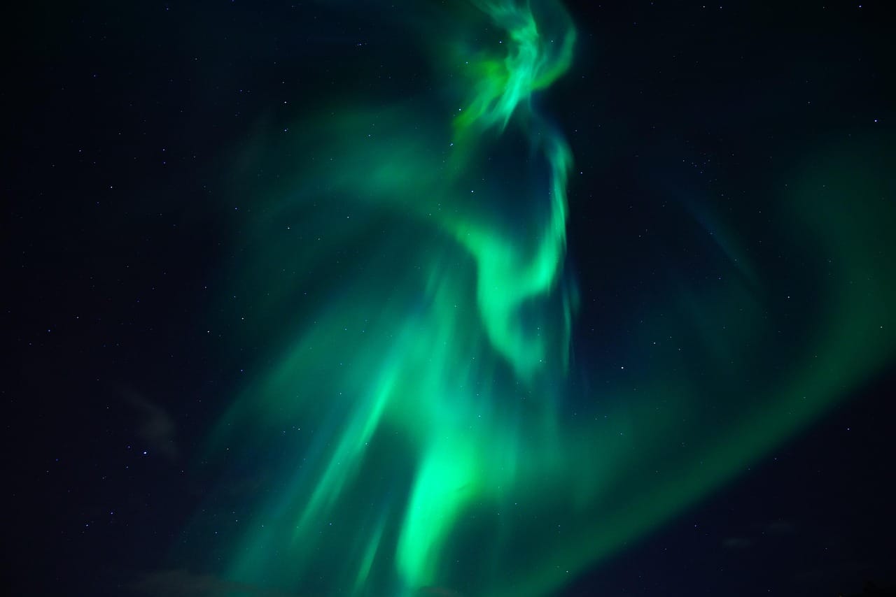
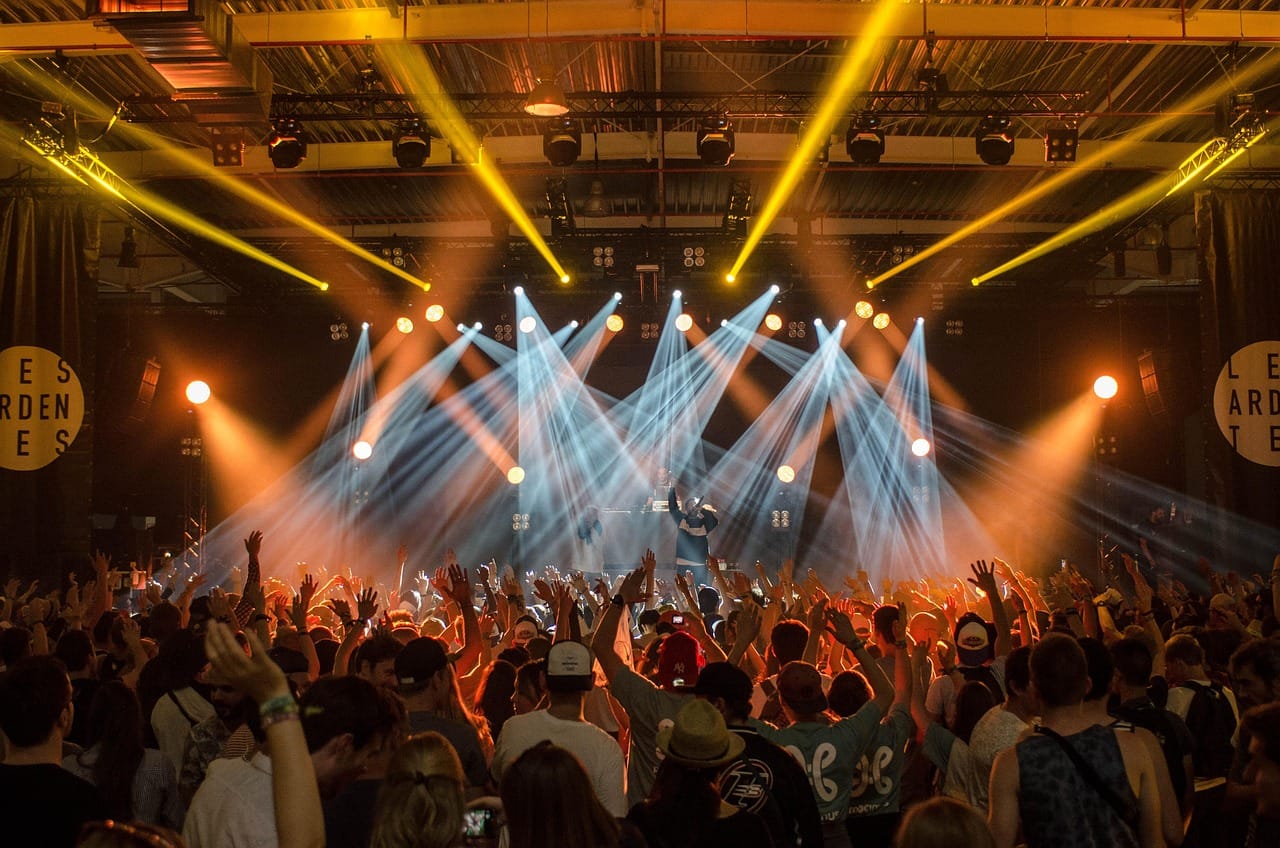
Nordlicht is a three-day music and light festival held every winter in a small town in the north, during the darkest weeks of the year. The programme mixes concerts, light installations and late-night film screenings. It had outgrown its old identity, a static logo designed for posters, at the moment when most of its audience was discovering it through screens.
The festival asked us for an identity that moves.
Designing movement first
Most identities are designed as still images and then animated later. We did it the other way around. Before we drew a single letter, Sam spent two weeks making short motion studies: light spreading across darkness, colours shifting slowly, shapes that grew and faded like the northern lights the festival is named after.
From about forty studies, we chose one behaviour: a soft band of colour that rises from the bottom of the frame, glows for a moment and fades. Everything in the identity grows from that behaviour.
We did not design a logo that moves. We designed a movement and then found the logo inside it.
Sam Okoye
A logo that is never the same twice
The logo is the festival's name, set in a wide, simple typeface, with a band of light passing behind it. The band is generated fresh every time: its colours, speed and shape change a little on every screen, every poster and every day of the festival. No two versions are identical, just as no two nights of northern lights are.
For print, we generated a thousand still frames and picked the best. The posters around the town each show a different frame, so the town itself looks like the sky is changing.
Colour in the dark
The festival happens mostly at night, in the snow. We chose a palette of deep blues, greens and violet that glows against dark backgrounds and stays readable on white snow. Every colour was checked on phone screens at low brightness, because that is how most people look at the programme: outside, at night, with cold fingers.
One system, many screens
The festival lives on many screens: huge projections on the town hall, a stage backdrop, social media, the app and small screens at the ticket gates. We built the identity as a simple tool that generates the moving band at any size and length. The festival's own small team can make a new animation for any screen in a few minutes, without calling us.
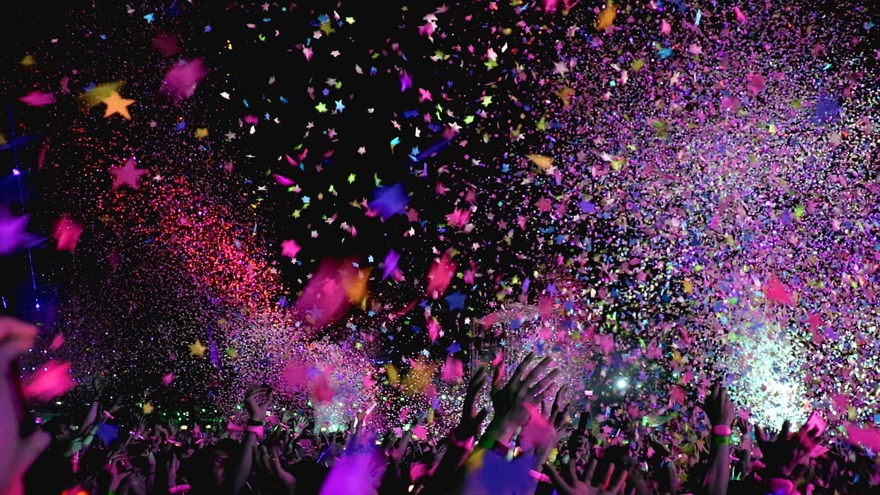
We also made a short opening film for each night. They play on the main stage before the first act, and they have become a ritual: the crowd counts down with the band of light as it rises.
Sound and light together
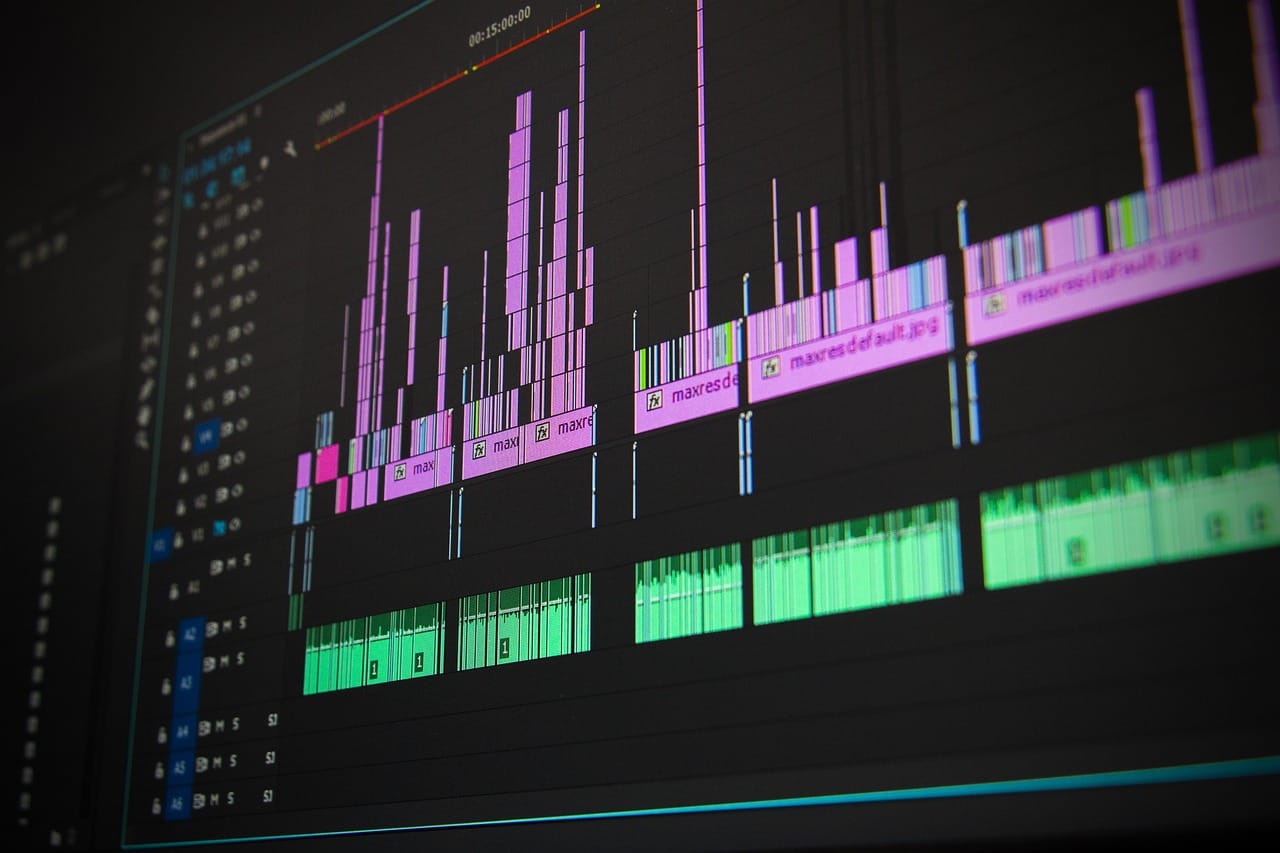
Nordlicht is a music festival, so the identity had to respond to sound. On the main stage, the band of light listens to the music through a microphone and moves with it: faster during loud passages, slower and softer during quiet ones. It is a small technical trick, but it makes the whole stage feel alive.
The result
Ticket sales rose by about a third in the first year of the new identity, and the festival sold out for the first time in its history. The opening films were shared widely online, and several other festivals asked the organisers who had made them. The part the local team loves most is simpler: children in the town now draw the logo with coloured chalk in the snow.
The festival app
Most visitors plan their festival on their phones, so the app was designed alongside the identity, not afterwards. It has one main screen: now and next, showing what is happening at every venue right now and what starts in the next hour. A second screen shows a simple map of the town with each venue marked by its own small band of colour.
The band of light appears in the app too, moving slowly behind the schedule. On the festival nights, its colours follow the real sky: when the northern lights appear above the town, a small alert tells everyone to look up. It happened twice during the first festival, and both times the main square went silent as thousands of people turned their phones away and watched.
A tool for the festival team
The generator that makes the band of light is a simple web page. The festival's team choose a size, a length and a mood, and it produces a new animation in seconds. They have used it to make more than four hundred animations so far, far more than we could ever have made for them.
Credits
Motion direction by Sam Okoye. Identity design by Sam Okoye and Tomás Reyes. App design by Aiko Tanaka. Creative direction by Lena Brandt.